A Name with a Story
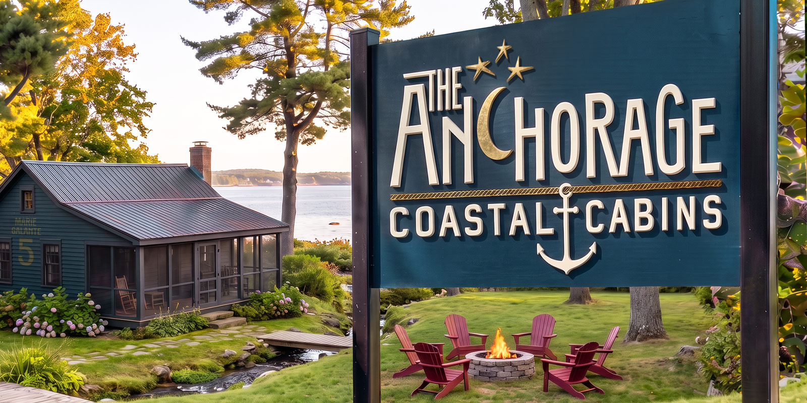
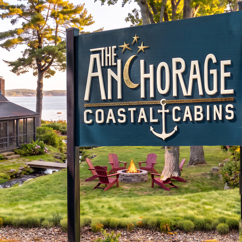
Reopening a 100-year-old coastal Maine property—an eclectic mix of cabins and motel-style rooms—called for a brand as spirited as its new owners. Named for the anchorages and colorful communities that completed the family’s love of sailing the Caribbean, The Anchorage needed an identity that honored its historical charm, embraced a nautical tone, and carried a touch of whimsy. The challenge: infusing that spirit across the property on a limited budget.
Built with Character
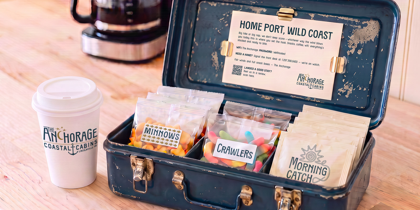
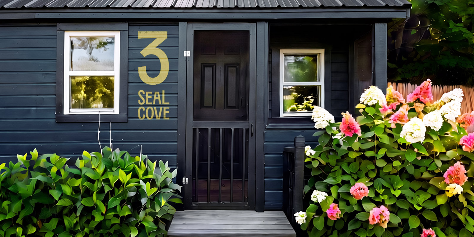
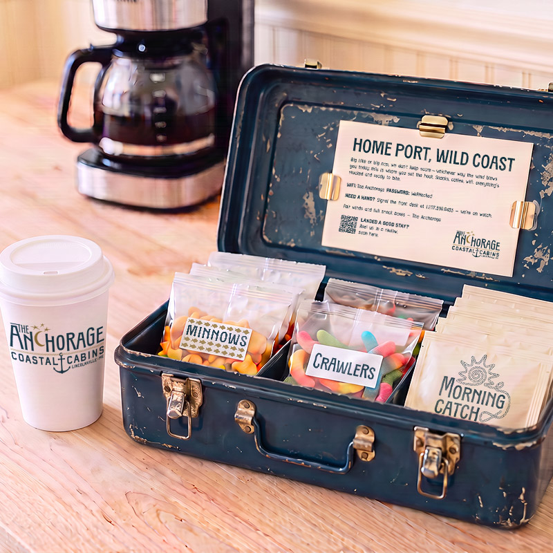
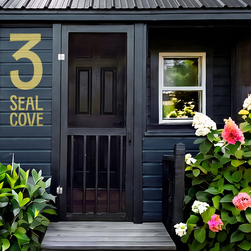
The identity system centered on a logo rooted in the property’s historical heritage, featuring a typeface reinterpreted with irregular letterforms—a nod to the property’s own patchwork of buildings. Deep nautical ocean tones echoed the property’s coastal surroundings, while gold accents drew from the gold-leaf paint used in Maine’s historical signage. To bring the brand to life affordably, the system leaned on high-impact, low-cost solutions: hand-painted cabin numbers and names, and custom peel-and-stick labels applied to antique tackle boxes and in-room goodies—infusing every rental with a sense of discovered charm.